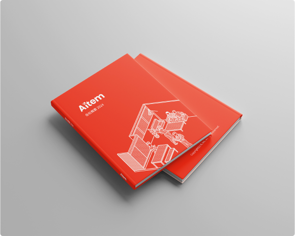
2022 BRAND IDENTITY, LOGO, WEBSITE, BUSINESS CARD, SOCIAL MEDIA
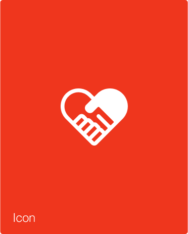
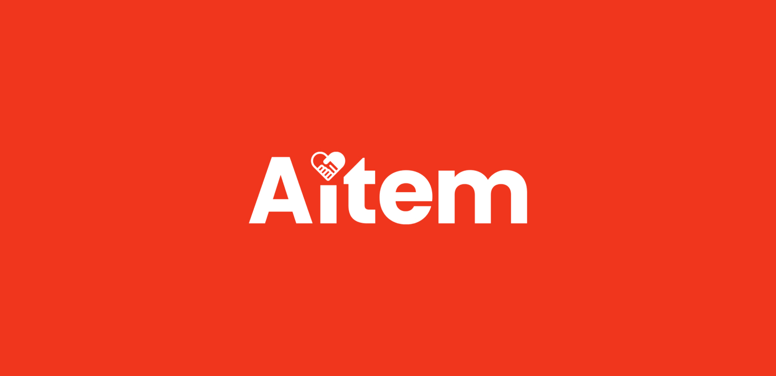
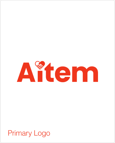
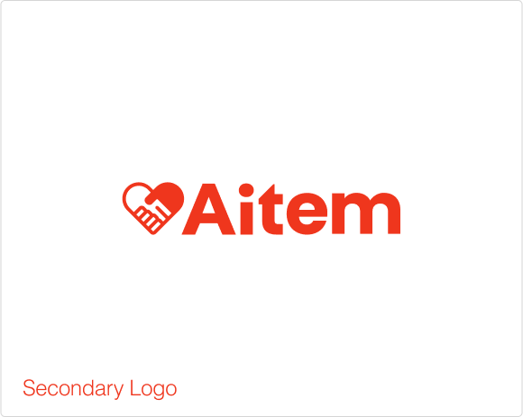
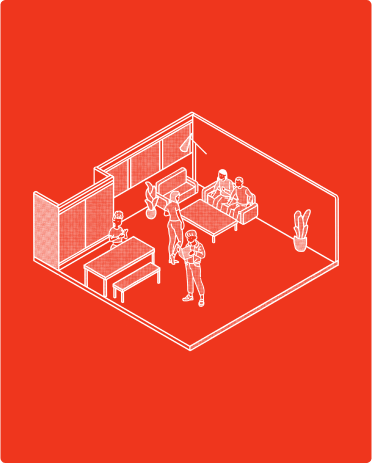
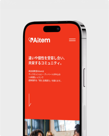
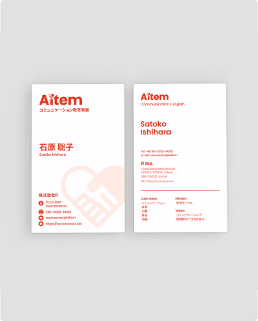
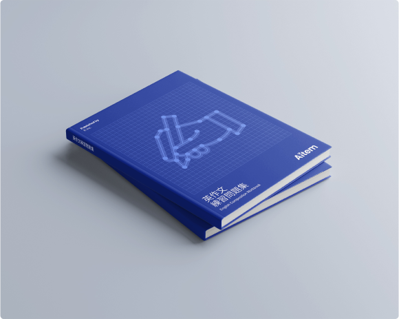
We rebranded Aitem to reflect the school’s mission of fostering communication, connection, and a welcoming learning environment. The logo now features a handshake within a heart, symbolizing the trust and support between students and the community. The vibrant red background conveys energy and passion, aligning with Aitem’s commitment to creating a positive space for learning and self-expression. Our goal was to design an identity that represents not just language learning, but also building relationships and personal growth through shared experiences.
英会話スクールのAitemは、彼らのユニークさである「コミュニケーションと温かい学びの場を育むこと」を体現するために、新しいブランドアイデンティティへと生まれ変わりました。ブランディングのプロとしての私たちの使命は、共に過ごす体験を通じて人と人とのつながりを深め、言語習得を超えて個々の成長を後押しするというアイデンティティを視覚化することでした。
ハートと握手を組み合わせたロゴには、生徒とコミュニティの間に築かれる信頼や、支え合いを表現しています。ブランドカラーである鮮やかすぎない赤色は、学びや自己表現のための前向きな環境作りに力を入れていることを表し、かつ、情熱的な印象を与えながらもカジュアルで暖かさを感じることができます。
Let’s work together!
Have a cool idea in your mind?
Let’s talk and bring it out into the world!